{ BRAND REFRESH · 2024 }
Warmer by Hand
A small, intentional refresh: six changes that made the Lovevery brand feel warmer and more lived-in, without losing what families already loved.
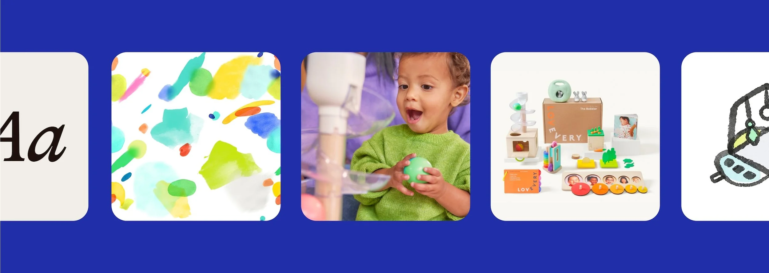
Scope
Type + Color
Photography
Icons + Patterns
Merchandising
Team
Graphic
Photo
Brand Marketing
Product
Channels
Website
Product Marketing
Print
Year
2026
Role
Art Direction & Graphic Design
Company
Lovevery
{ THE CHALLENGE }
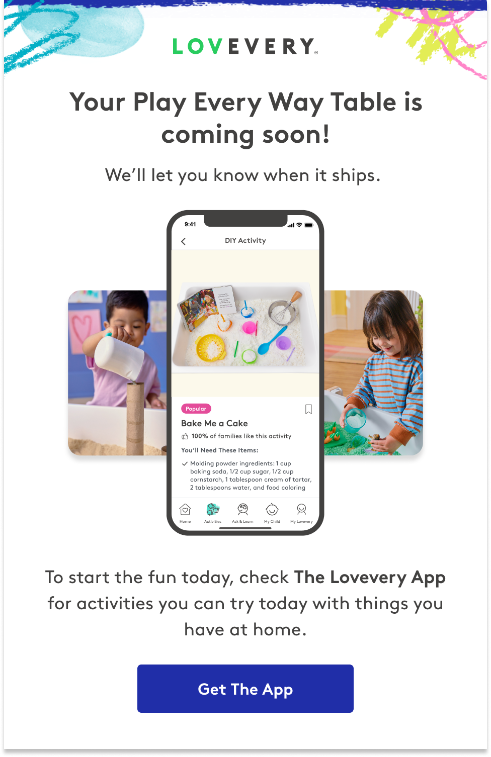
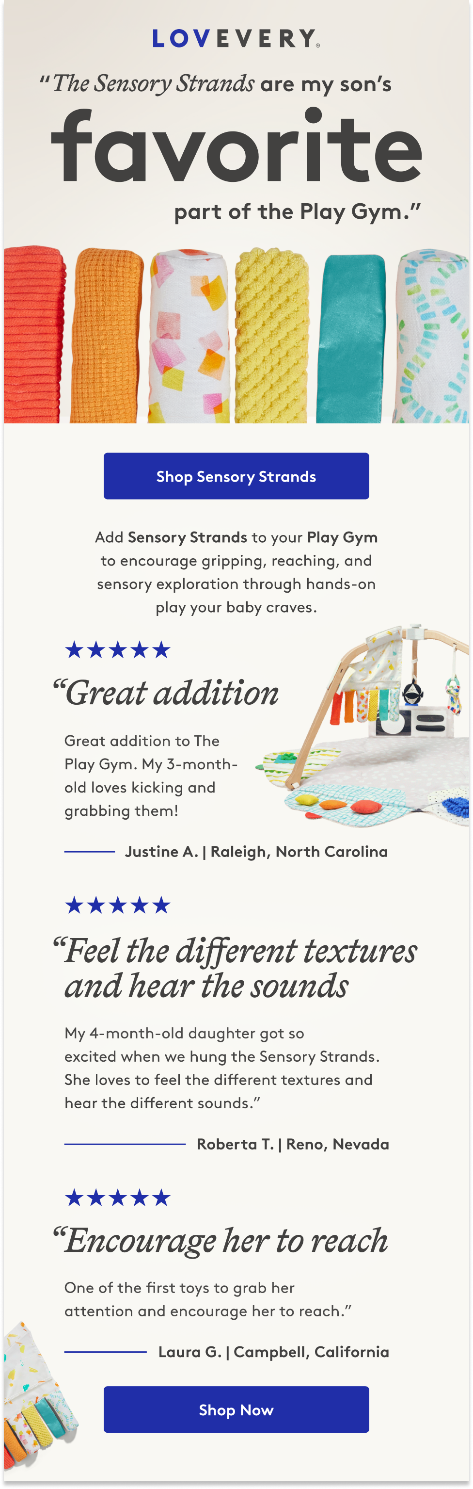
Small gaps were starting to make the brand feel dated. Rather than a big reinvention, we softened it, making it warmer and more lived-in while keeping everything families already recognized.
{ WHAT CHANGED }

Color
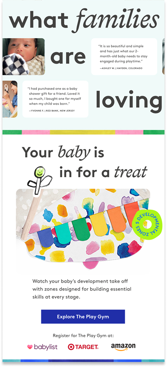
A deeper blue for accessible contrast.
Type
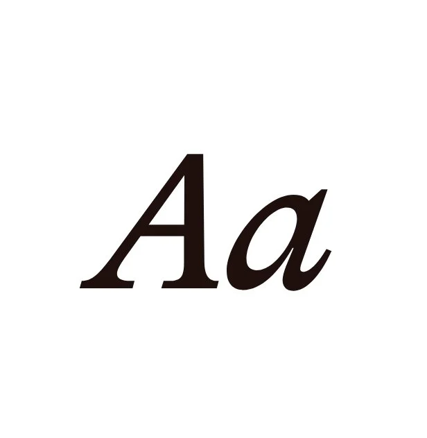
A second typeface joined the core font.
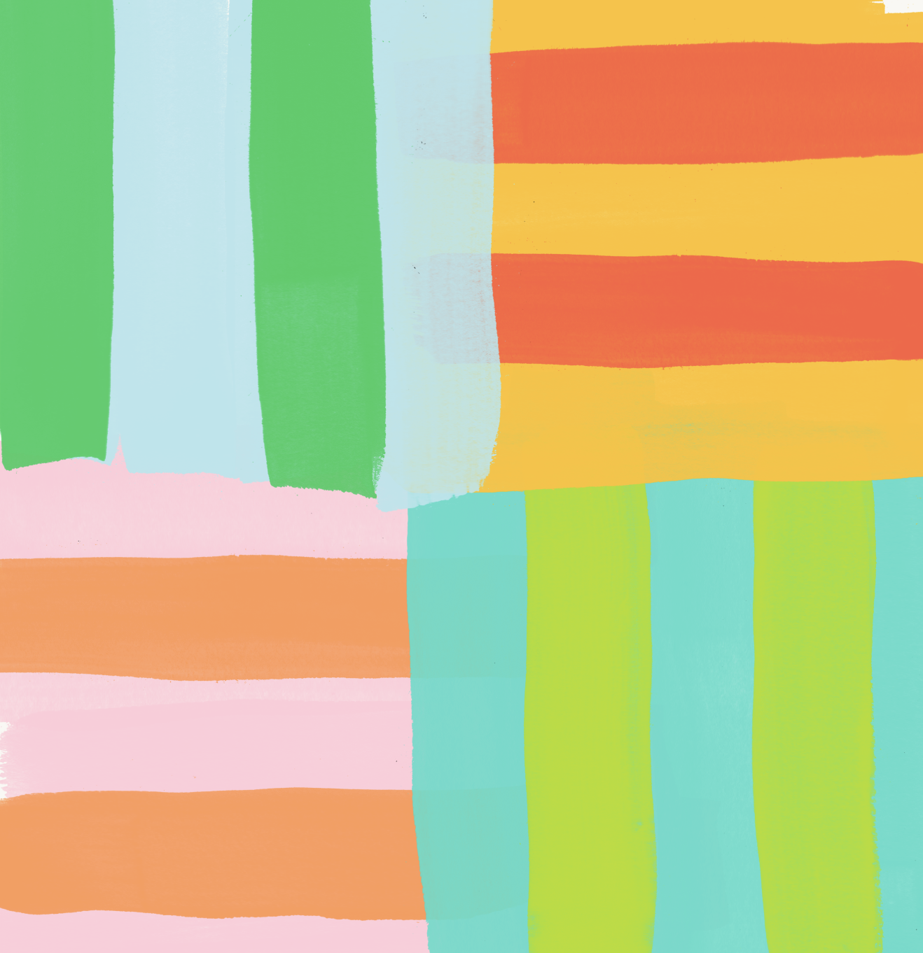
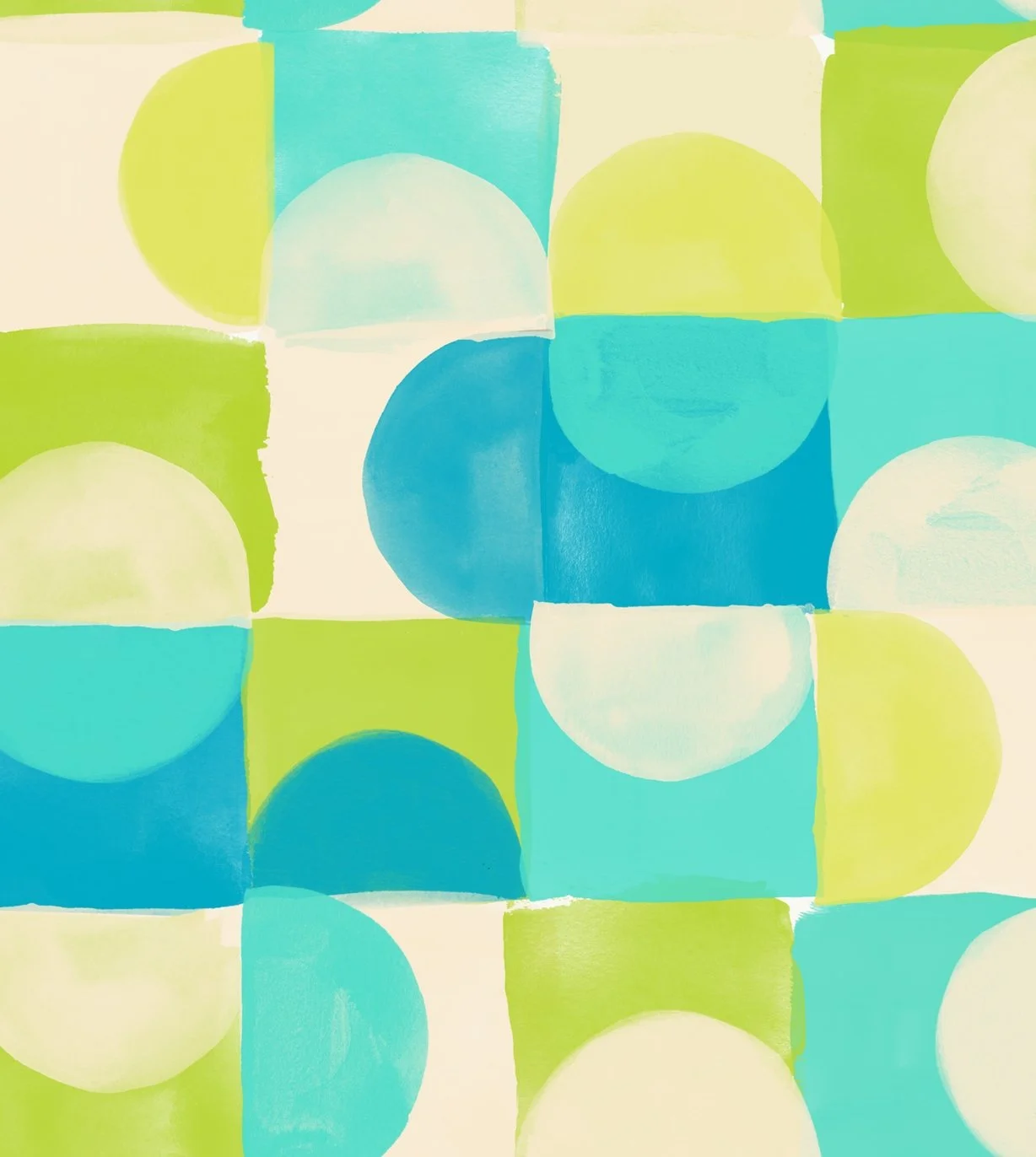
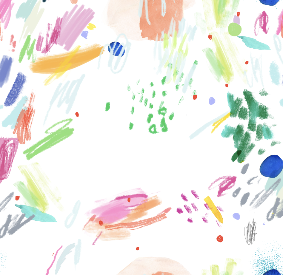
Patterns
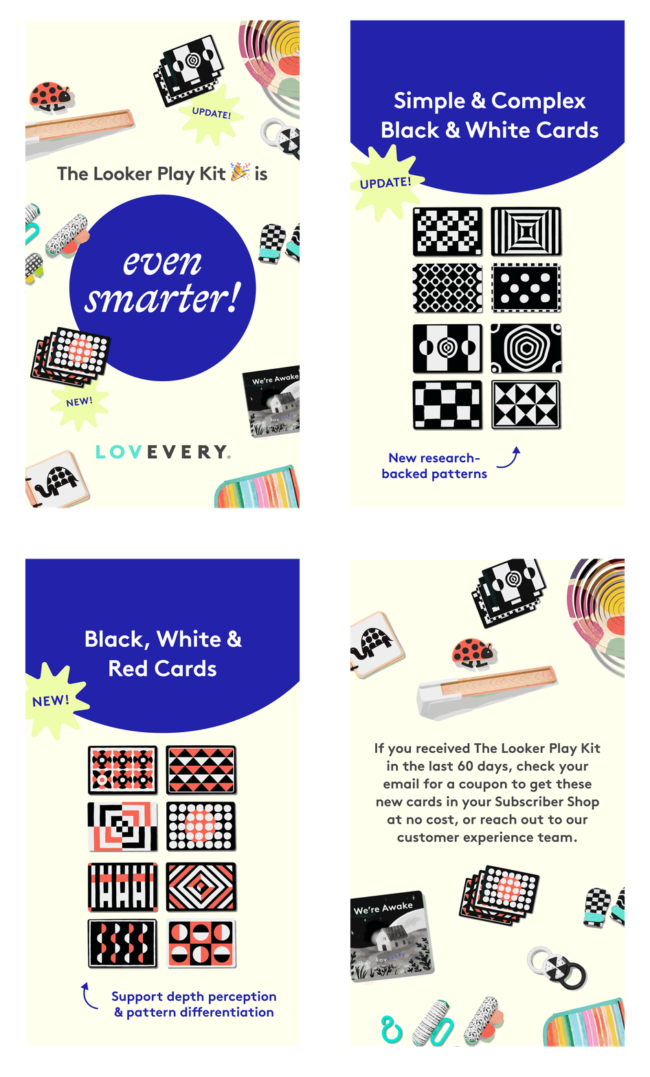
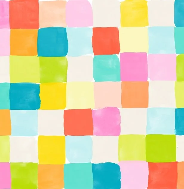
New patterns added to the library.
Photography
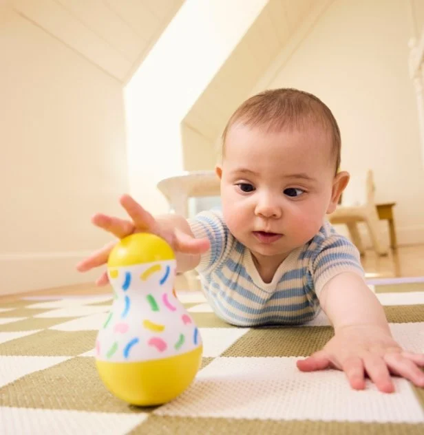
Bright and airy became warm and diffused.
Icons
Vector icons, redrawn by hand.
Studio
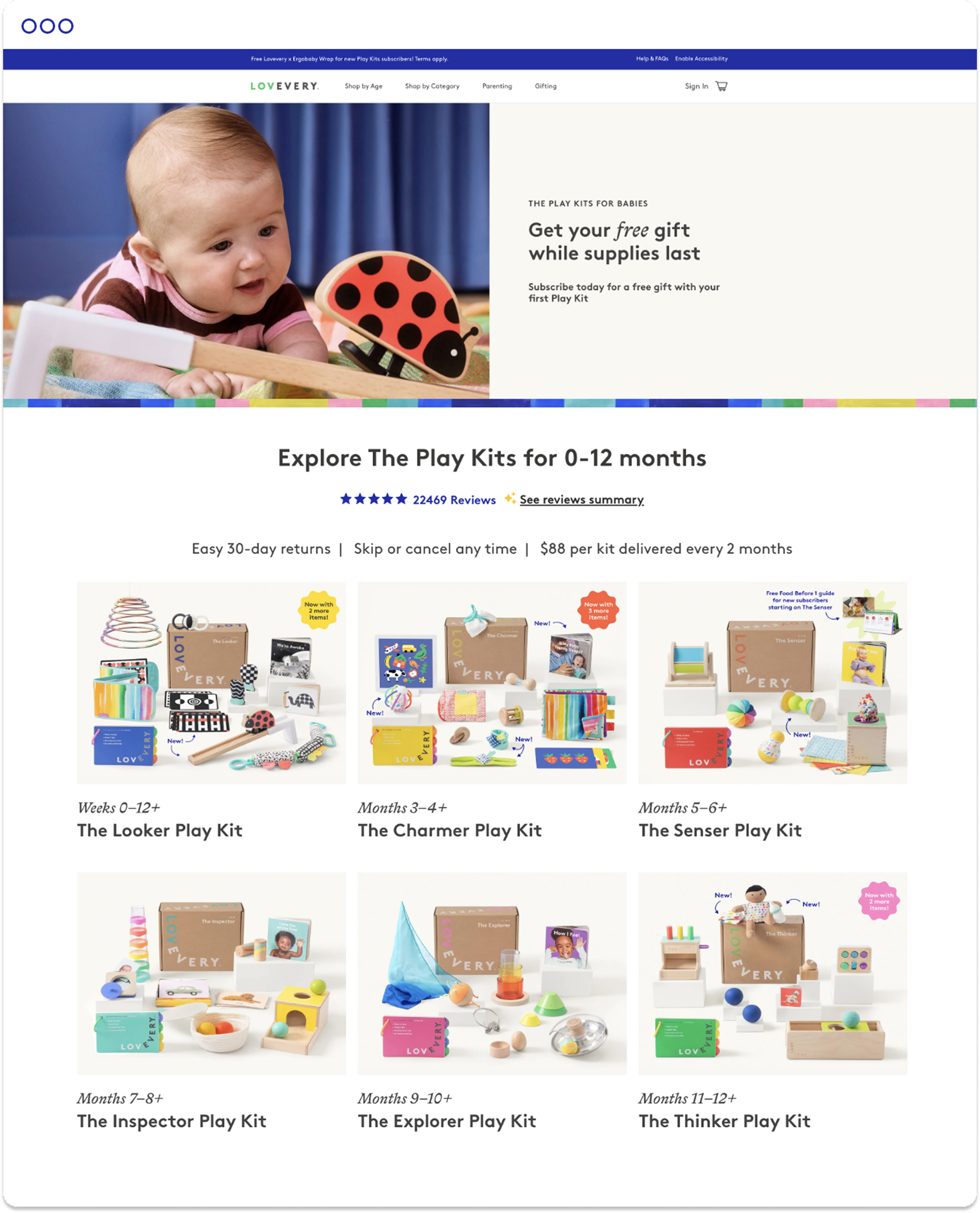
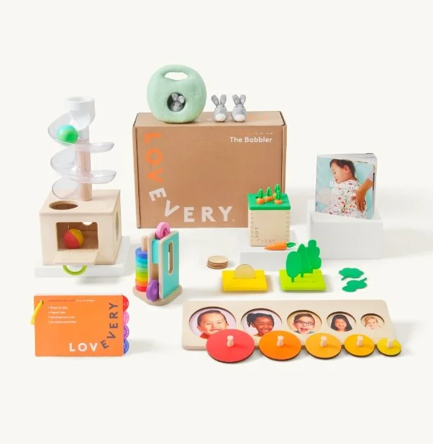
Every Play Kit, reshot.
{ BEHIND THE REFRESH }
How we got there
A small refresh still took a lot of exploring. Every change was tested, compared, and narrowed down before anything went live.
Moodboard
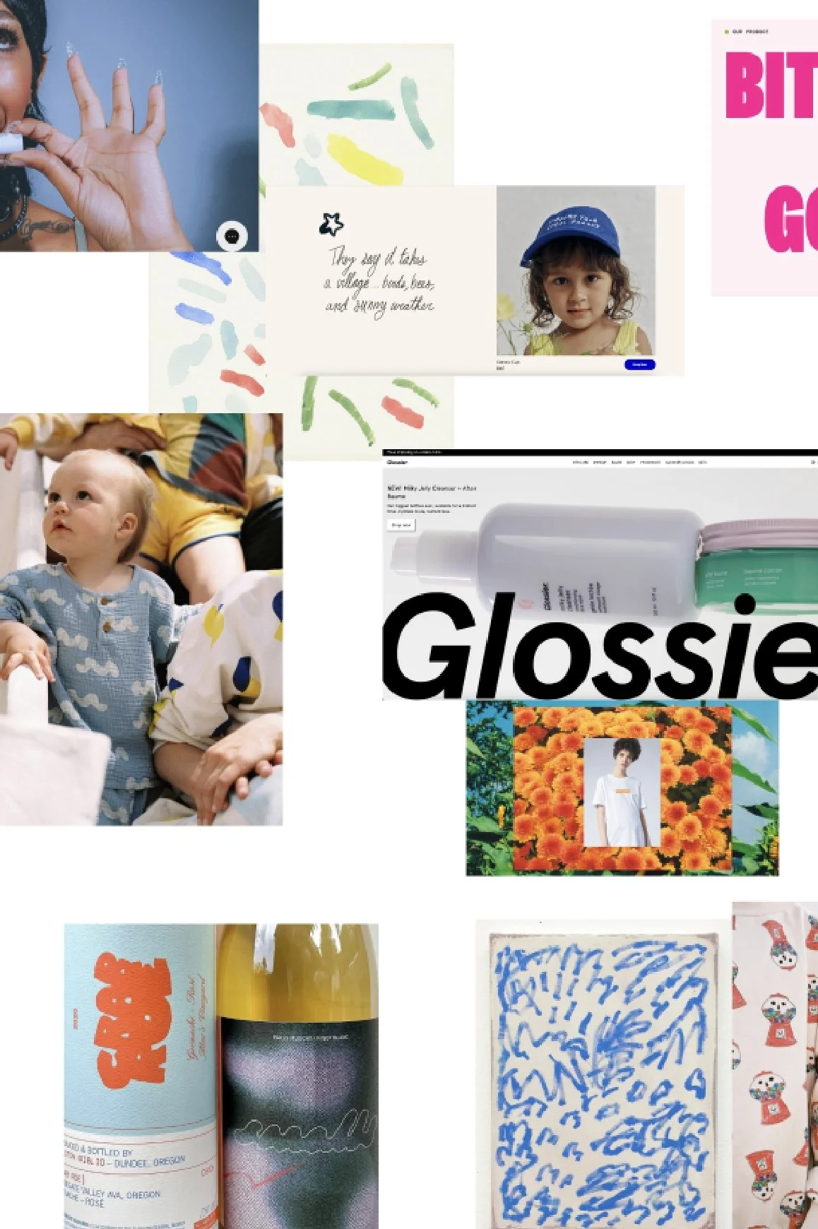
Layered patterns, hand-drawn marks, and warm, candid photography: references for a brand that felt softer and more lived-in.
Lighting Tests
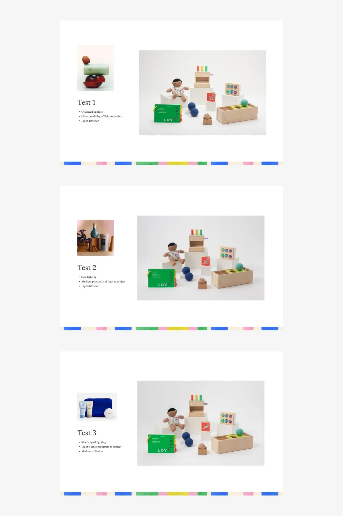
Three lighting setups tested on the Play Kit product shots before landing on warm, diffused light.
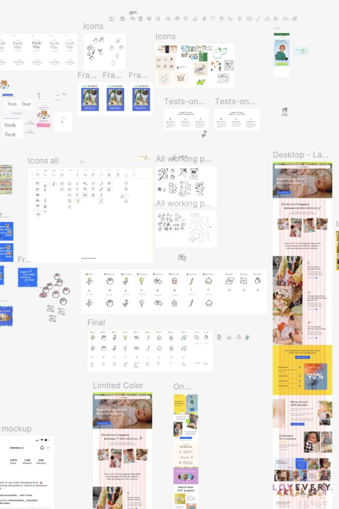
Graveyard
Where ideas go to die, and where the good ones were found. A peek at the messy middle of the refresh.
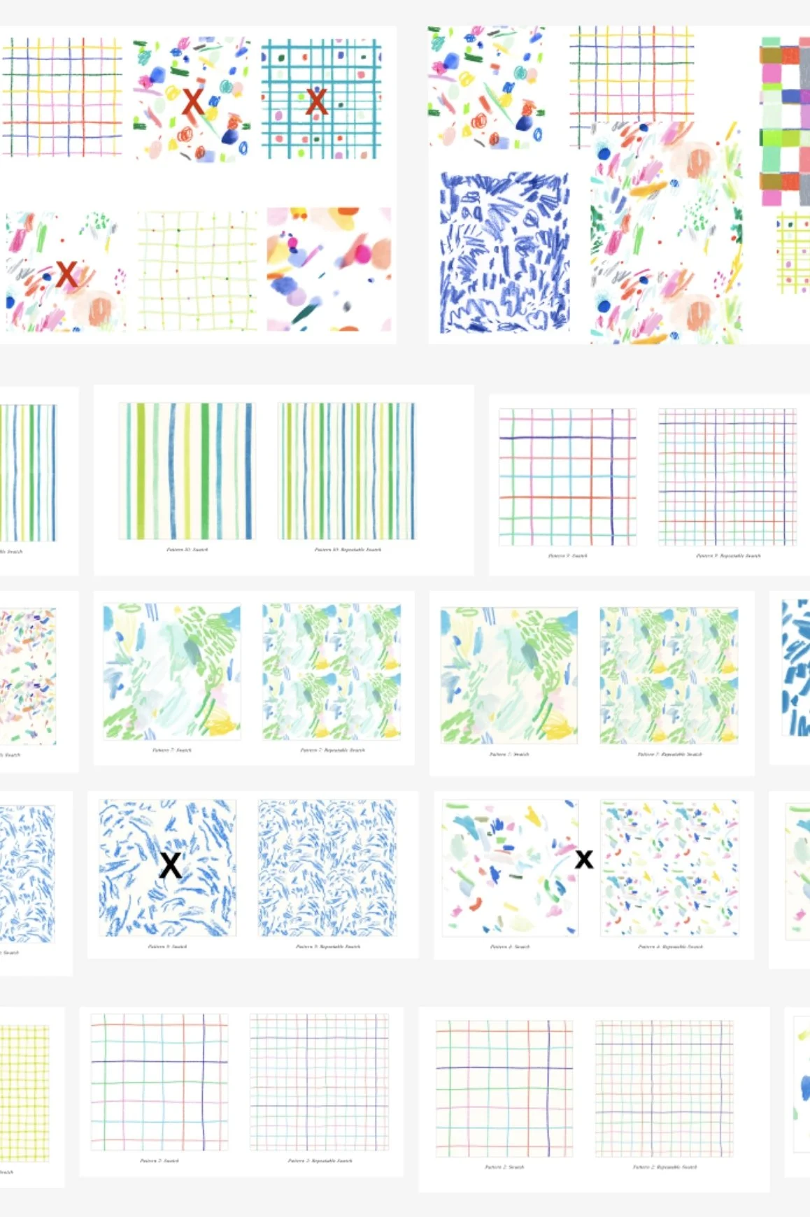
Pattern Sketching
Dozens of hand-drawn patterns explored and edited down. Each X marks one that didn’t make the library.
The final result
{ TYPE }
A second voice
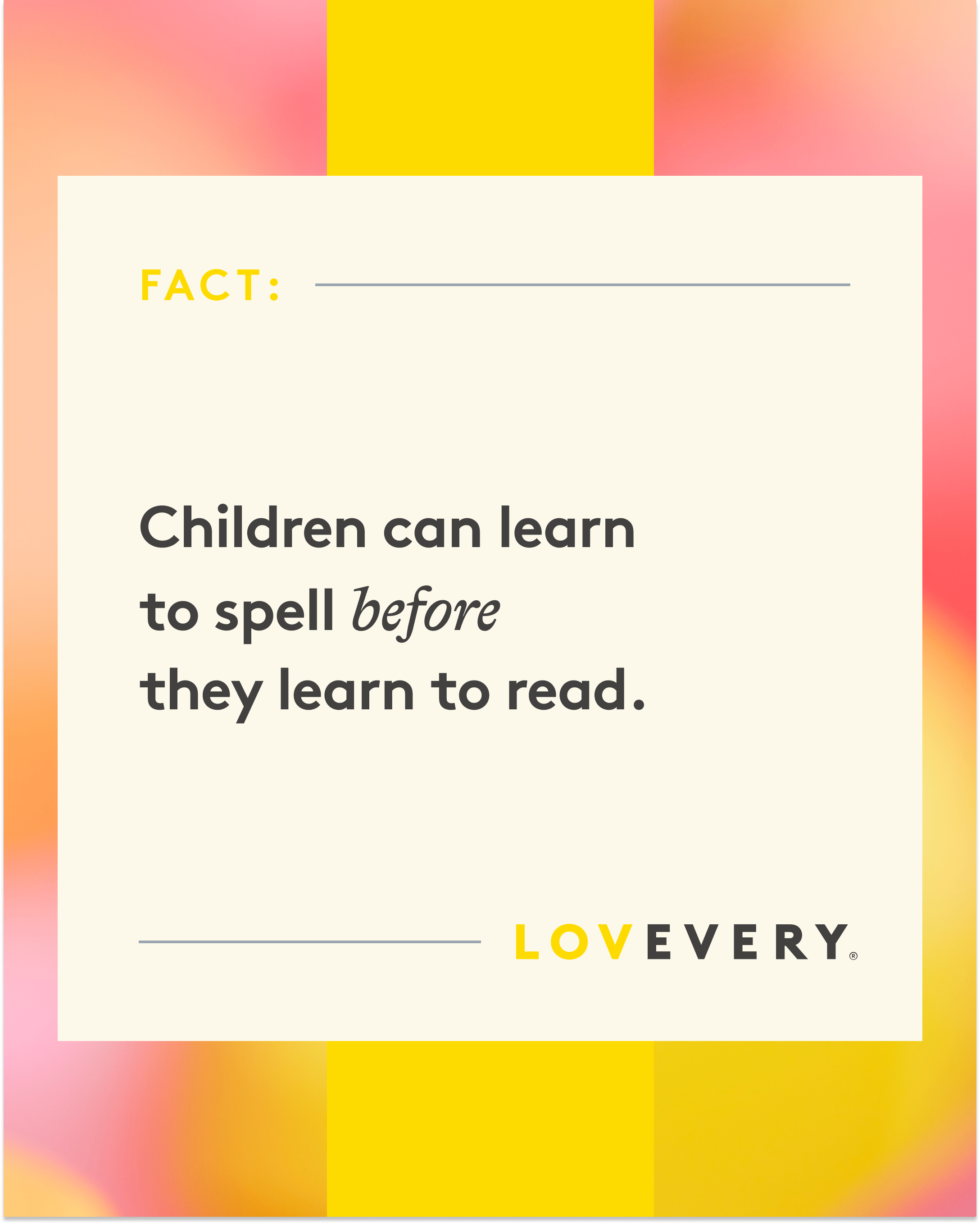
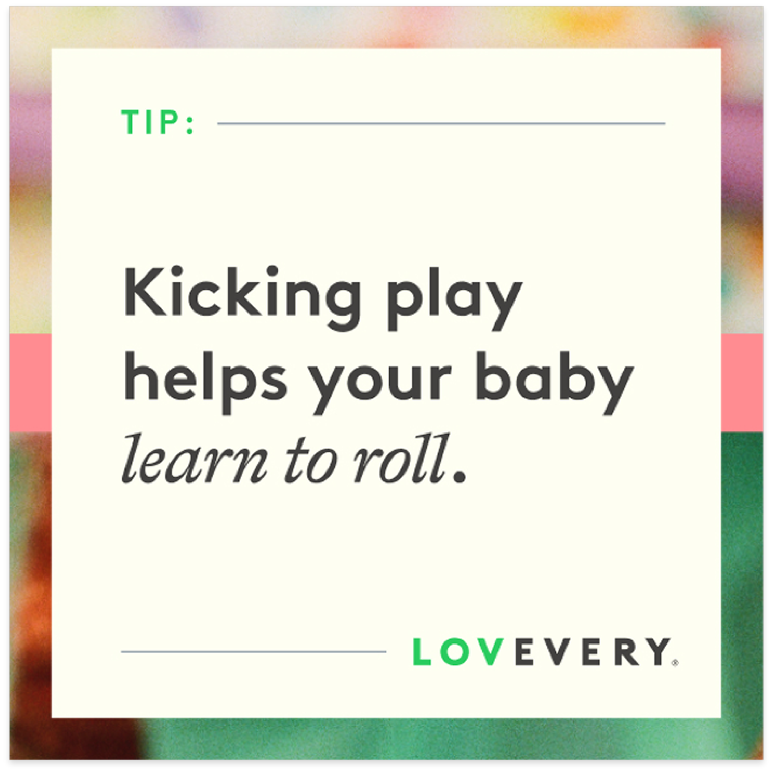
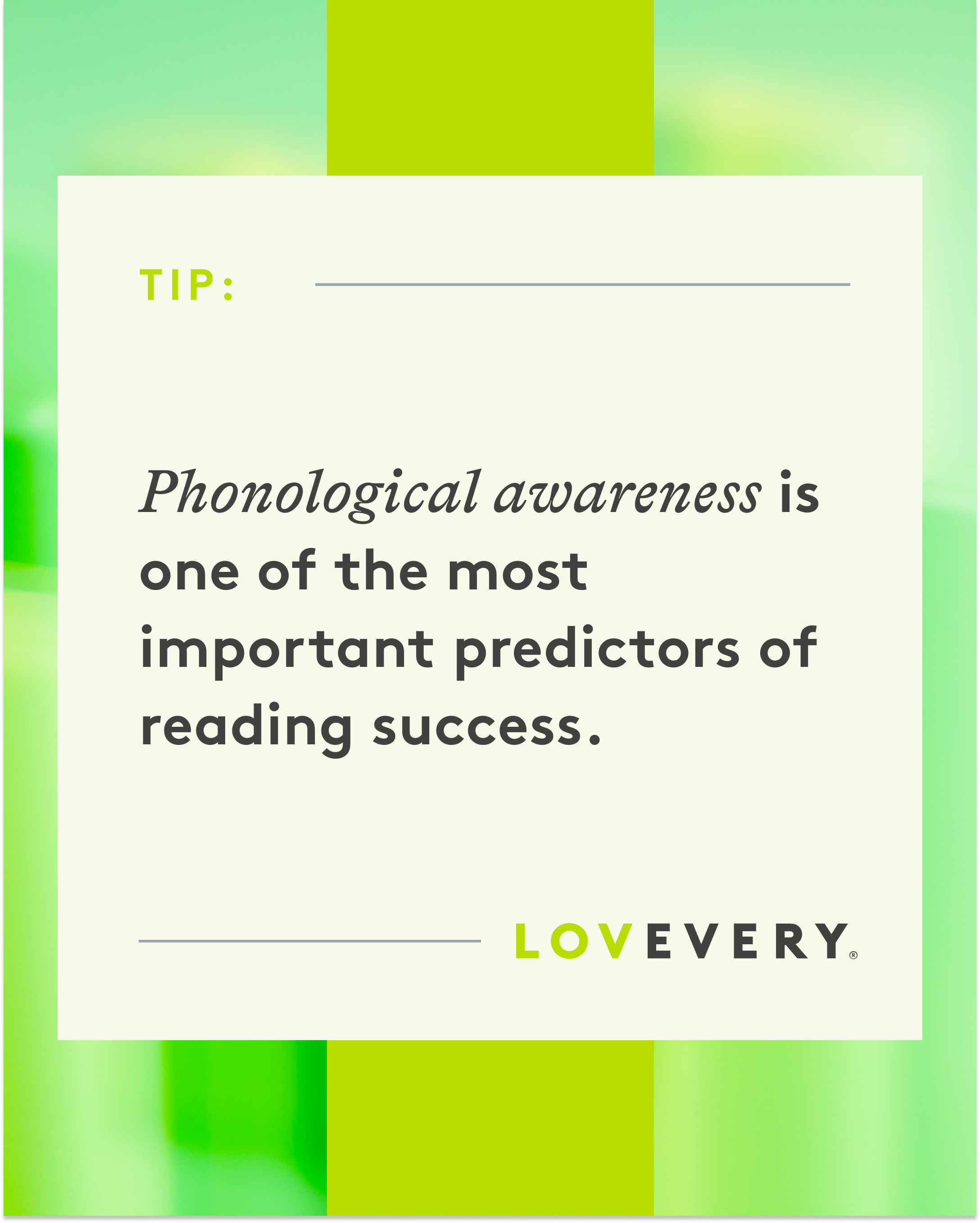
Adding a single secondary typeface opened up our design playground, while the core font kept everything consistent.
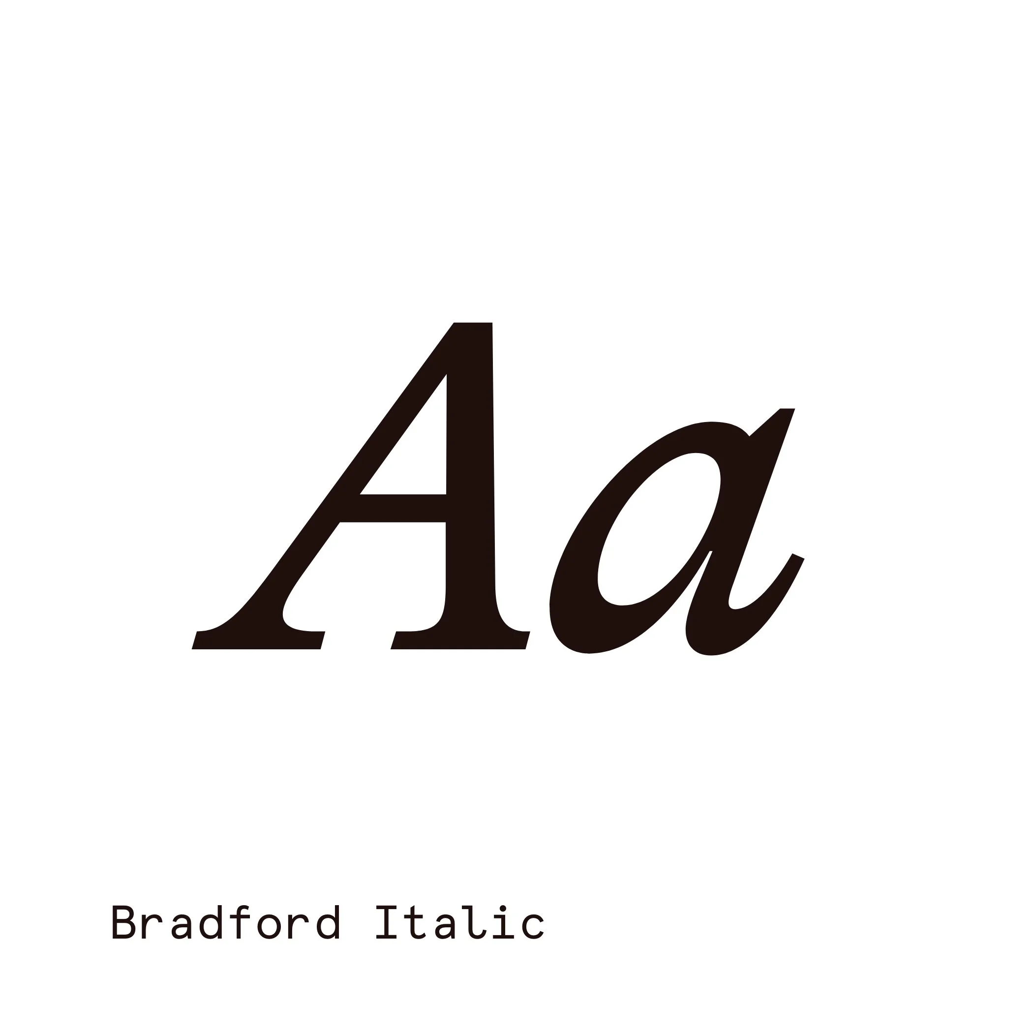

Core
Secondary/Accent

Execution
{ COLOR }
Built for accessibility
A deeper blue joined the palette, giving text and buttons the contrast they needed on every background.
NEW
{ PHOTOGRAPHY }
From bright to warm
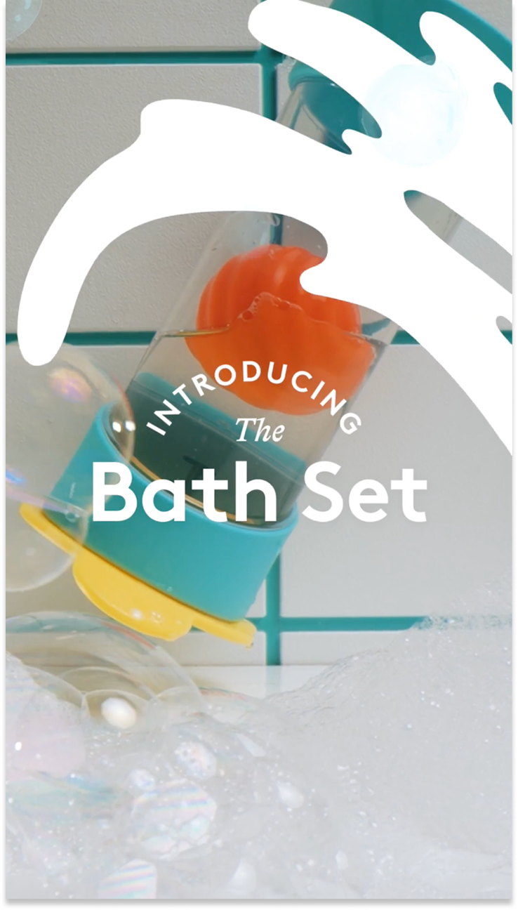
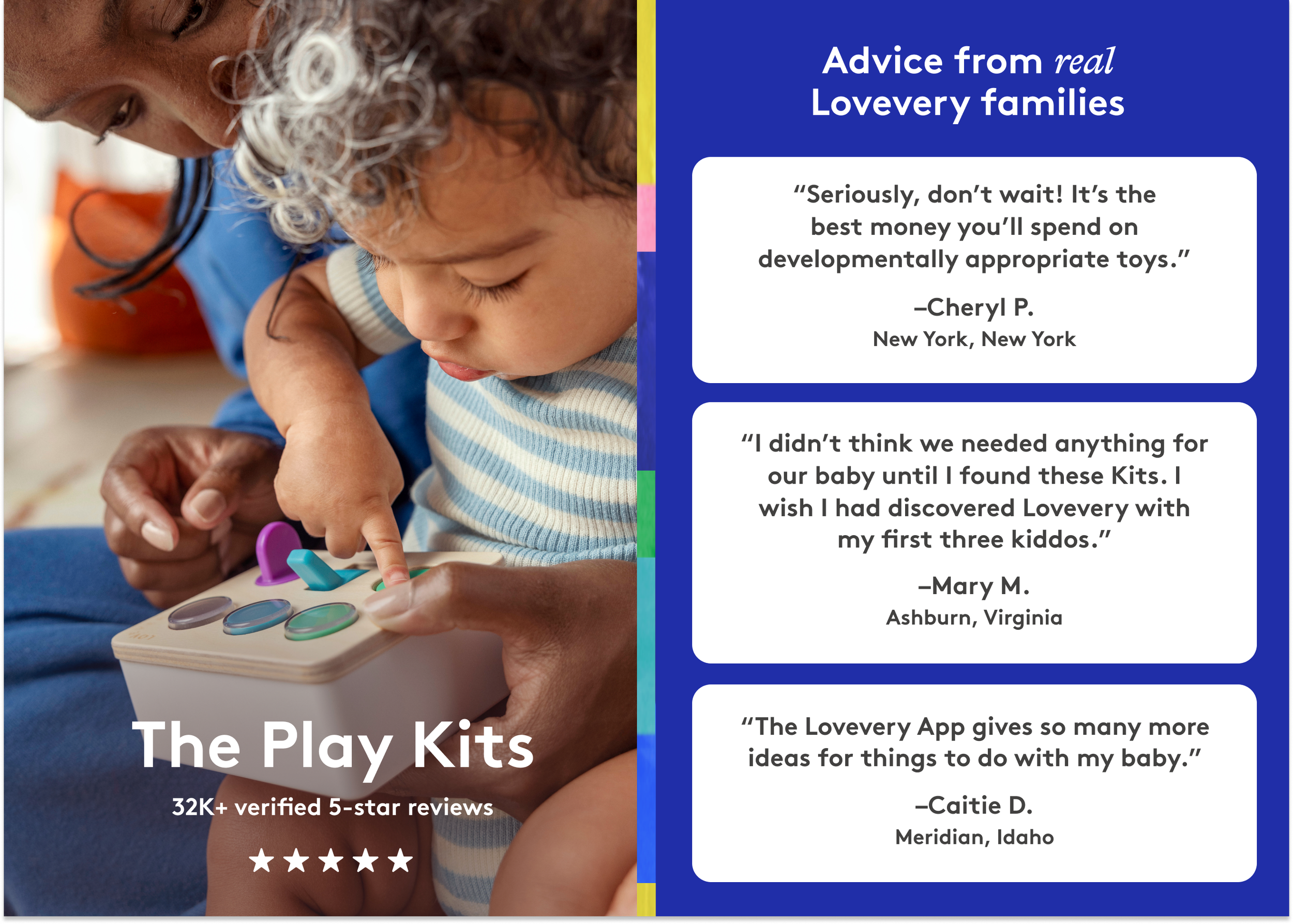
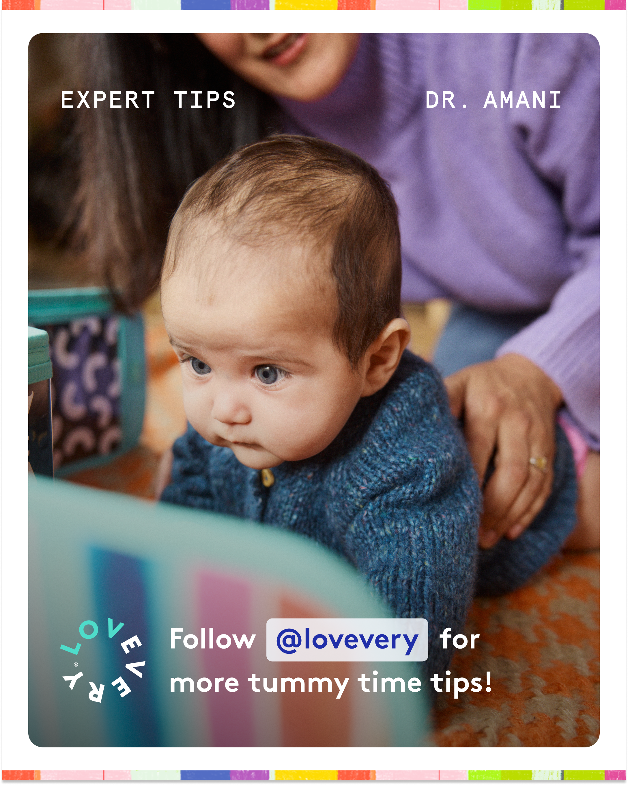
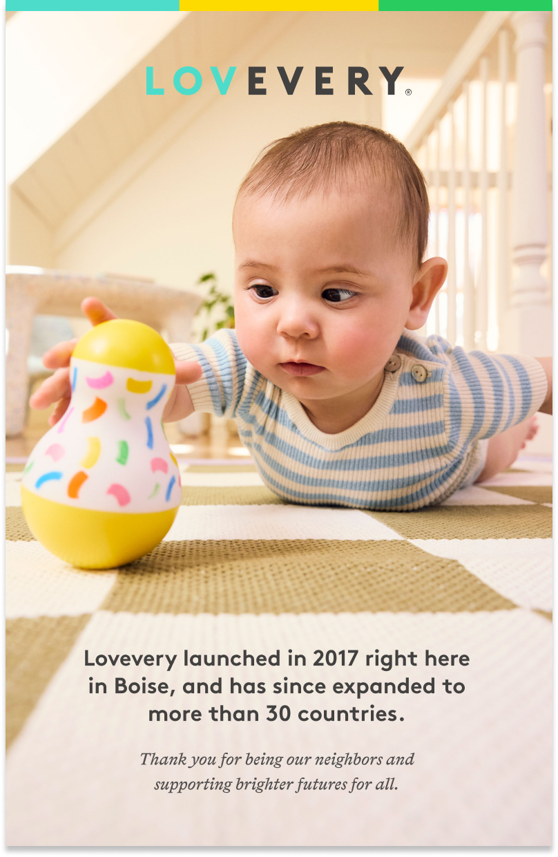
The biggest shift: bright, airy photography gave way to warm, diffused light that feels like real afternoons at home.
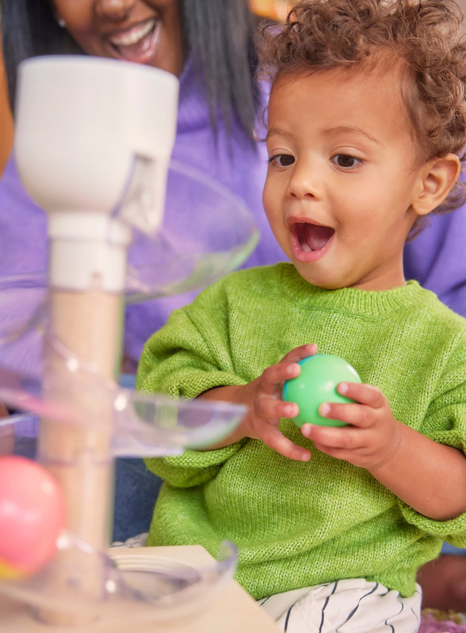
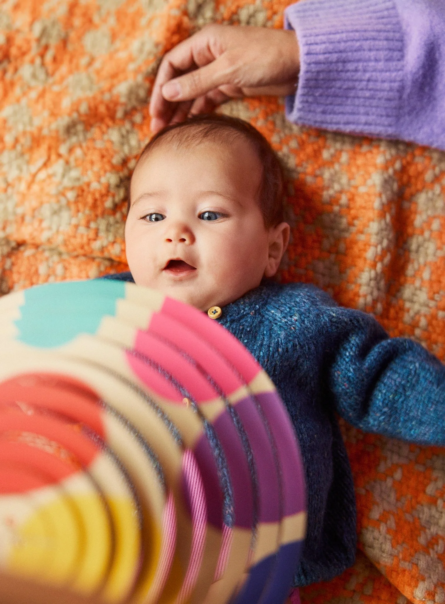
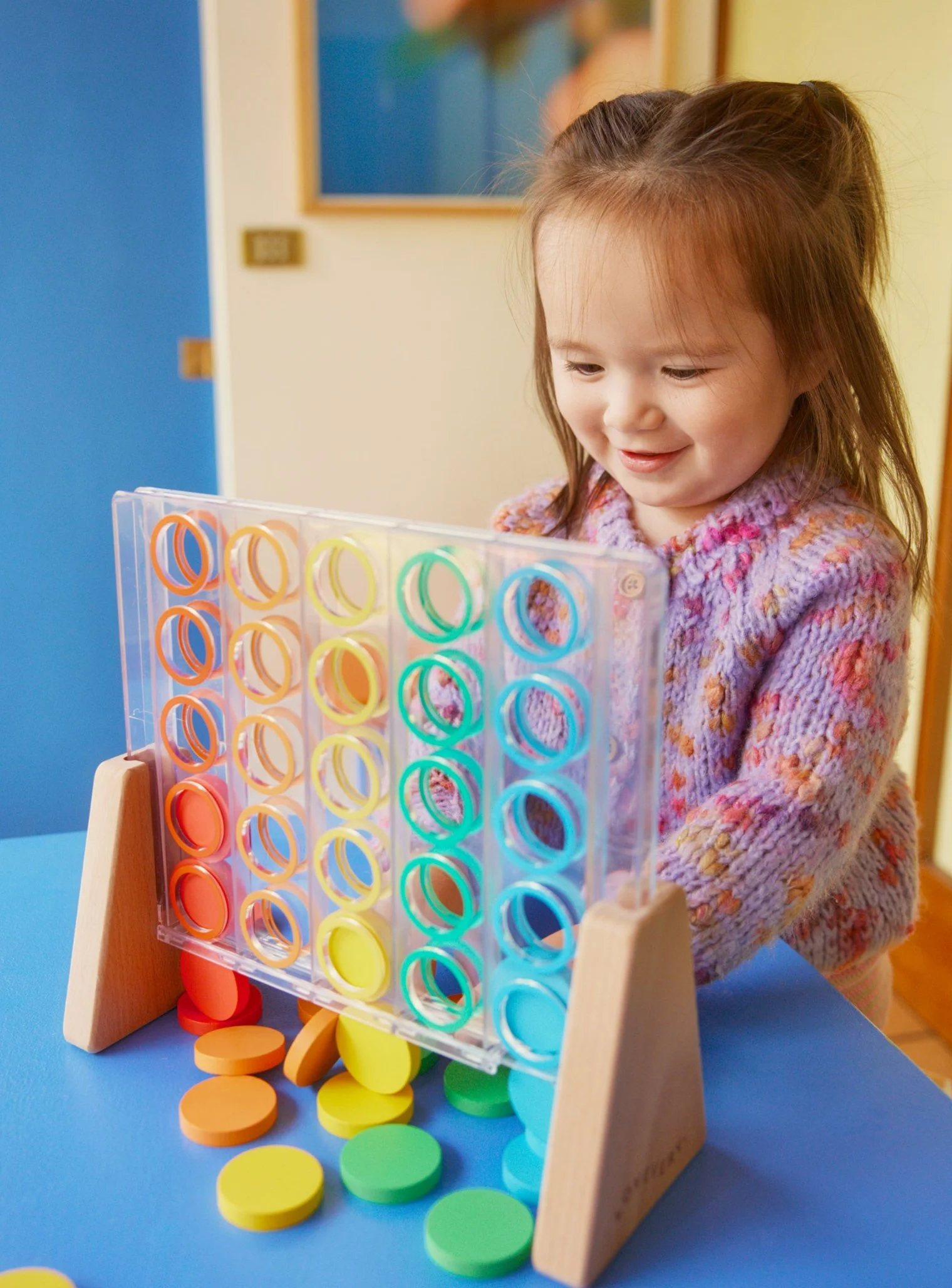
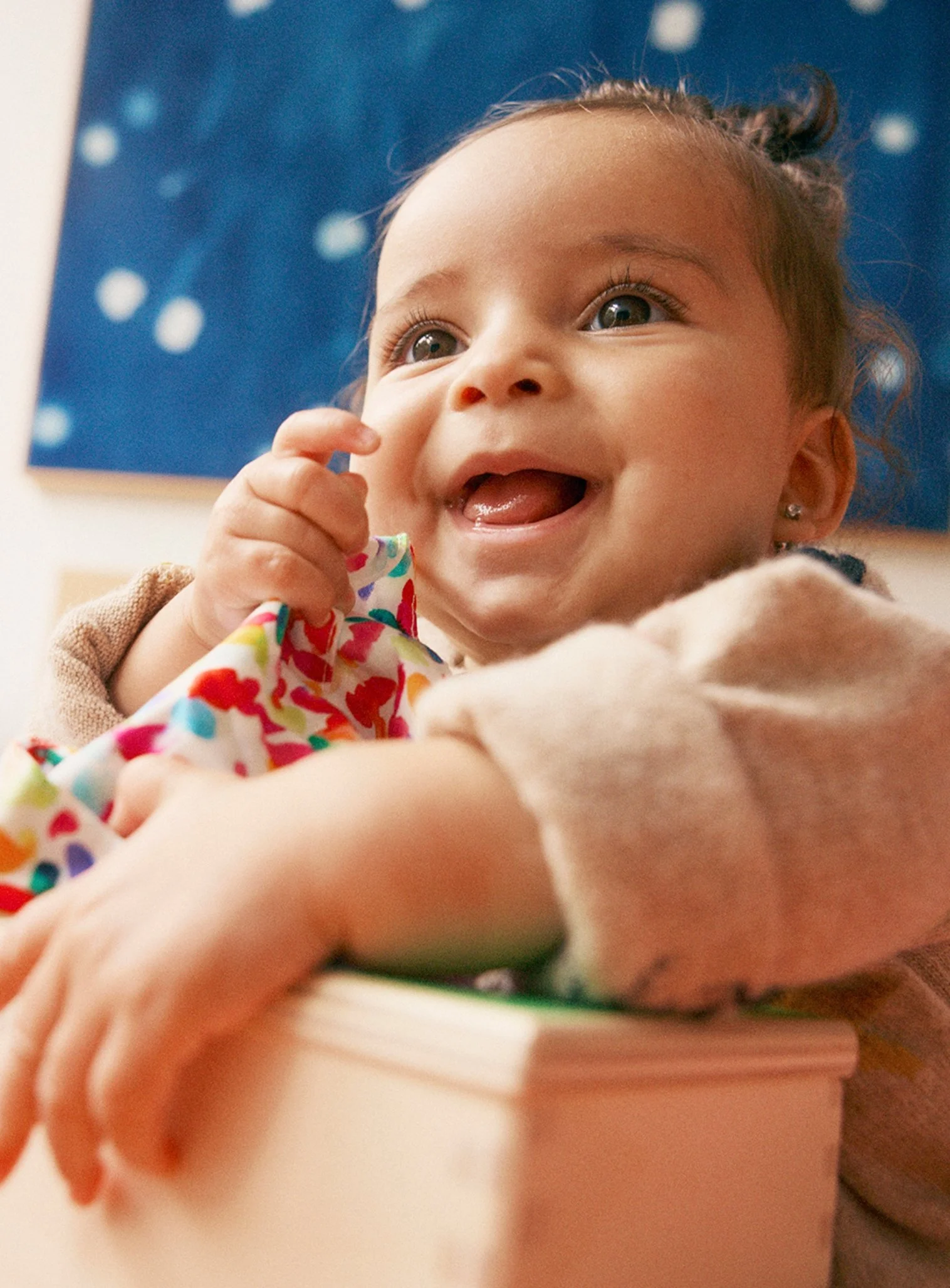
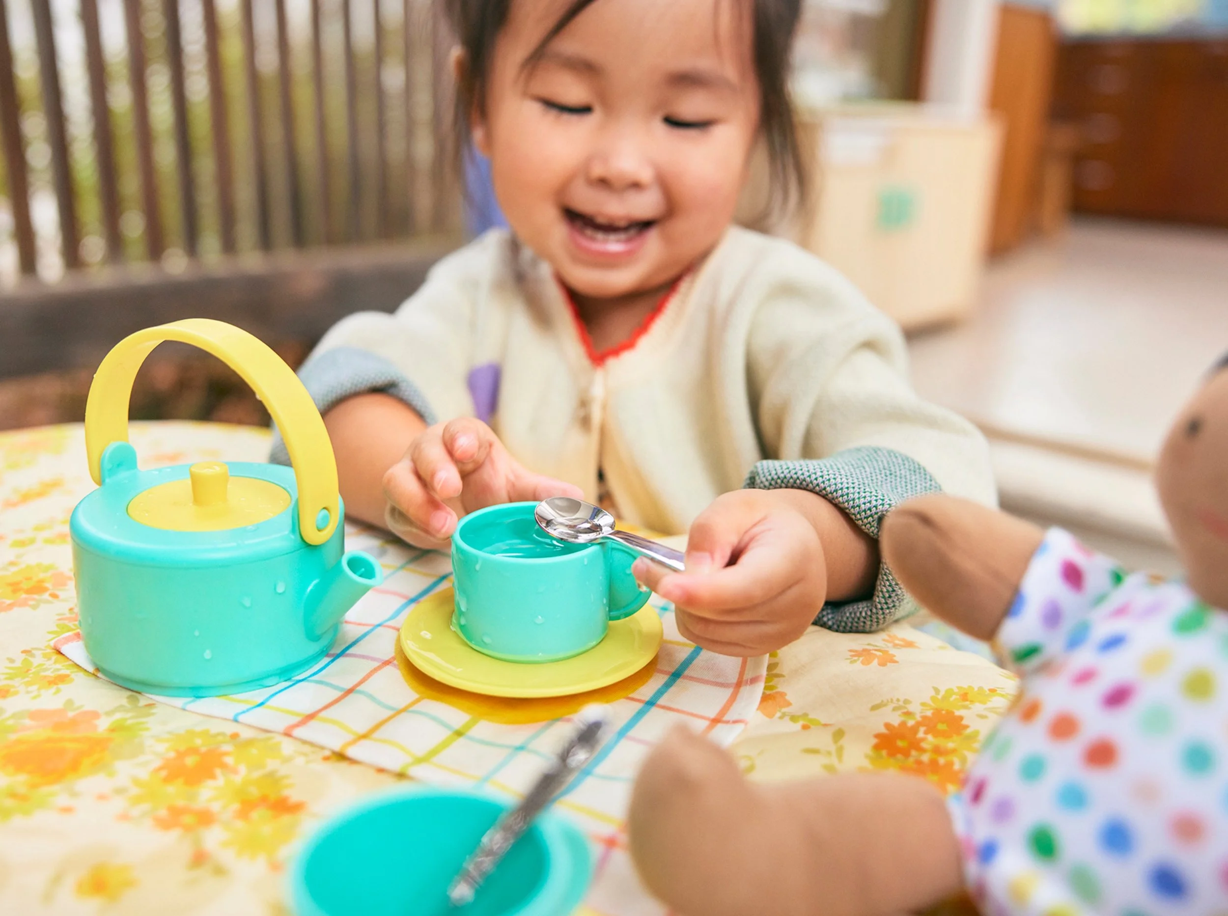

Warm · Diffused
Before
Bright · Airy
After
{ ICONS }
Drawn by hand
Vector icons felt cold. Redrawn by hand, even the smallest details now carry the warmth of the brand.

Vector
Before
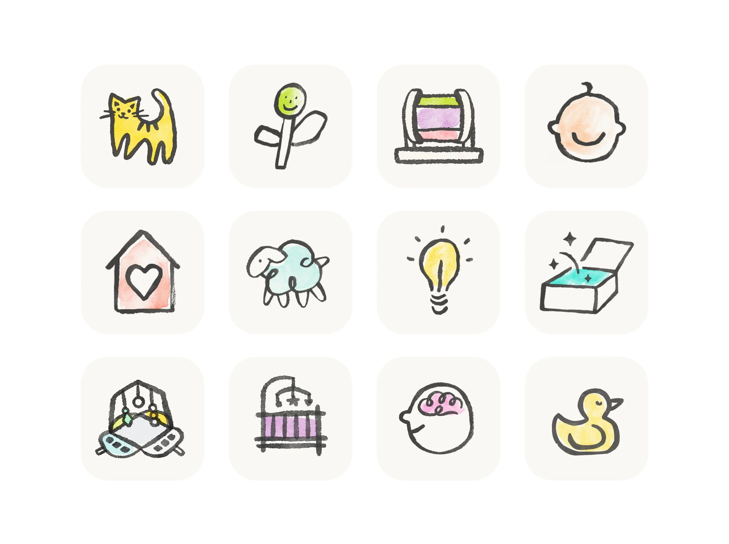
After
Hand-drawn
{ PATTERNS }
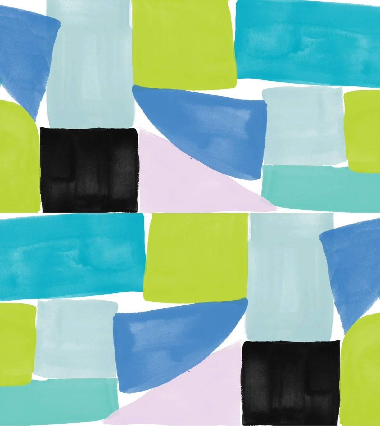
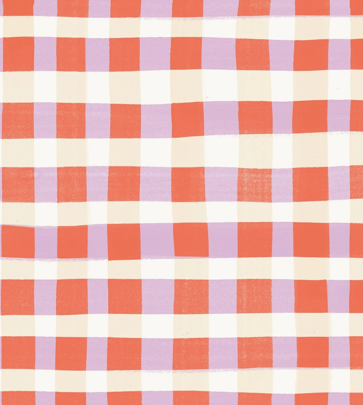
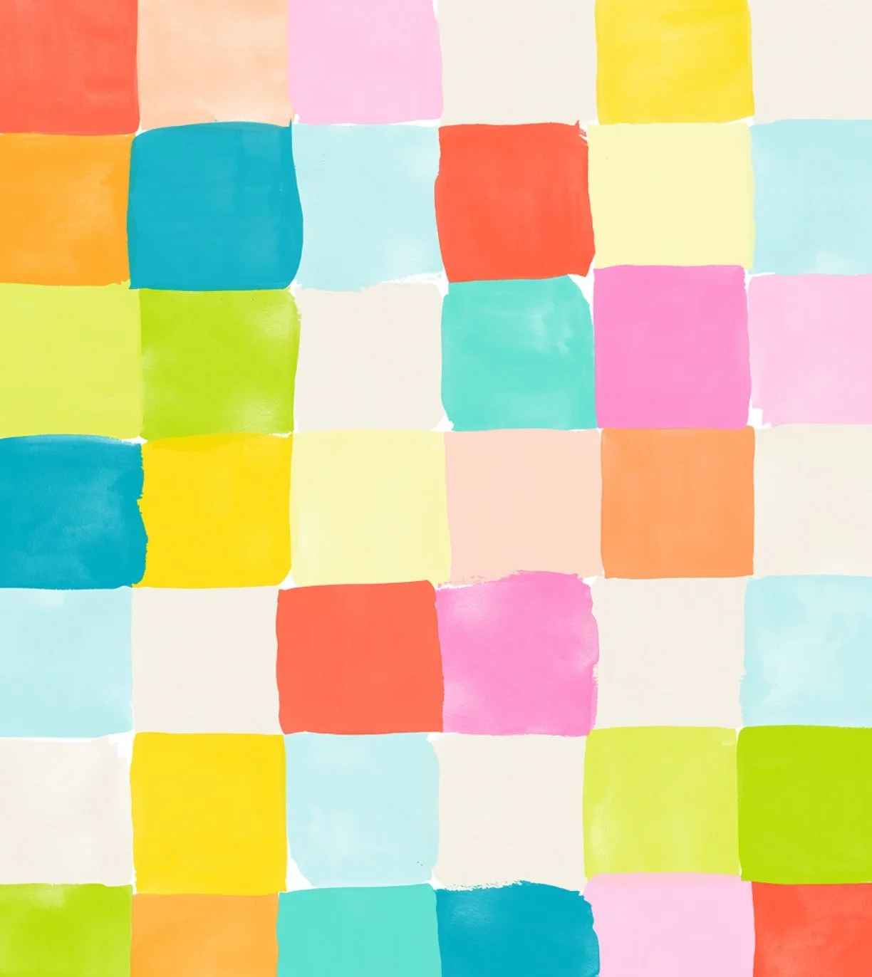
A richer library
New hand-painted patterns, from loose brushstrokes to playful grids, gave every layout more texture and warmth.
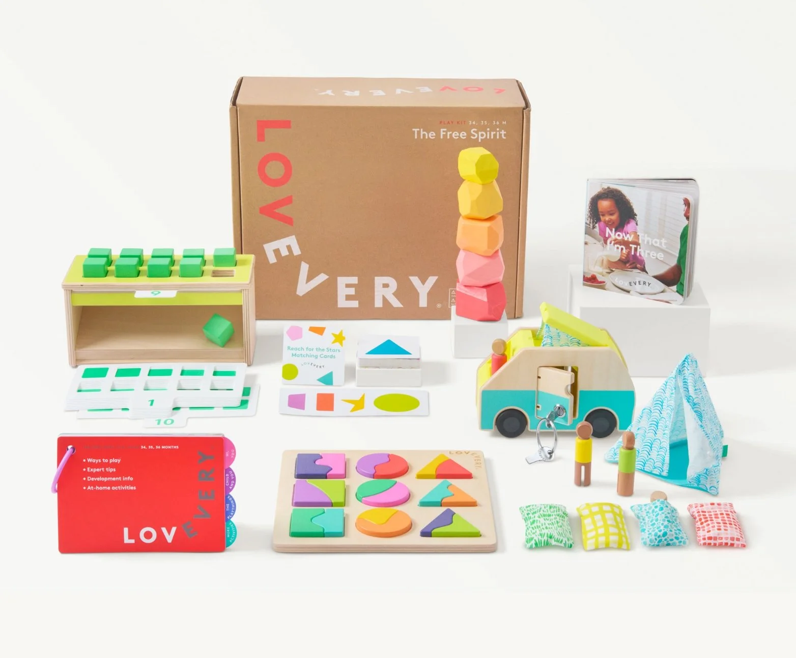
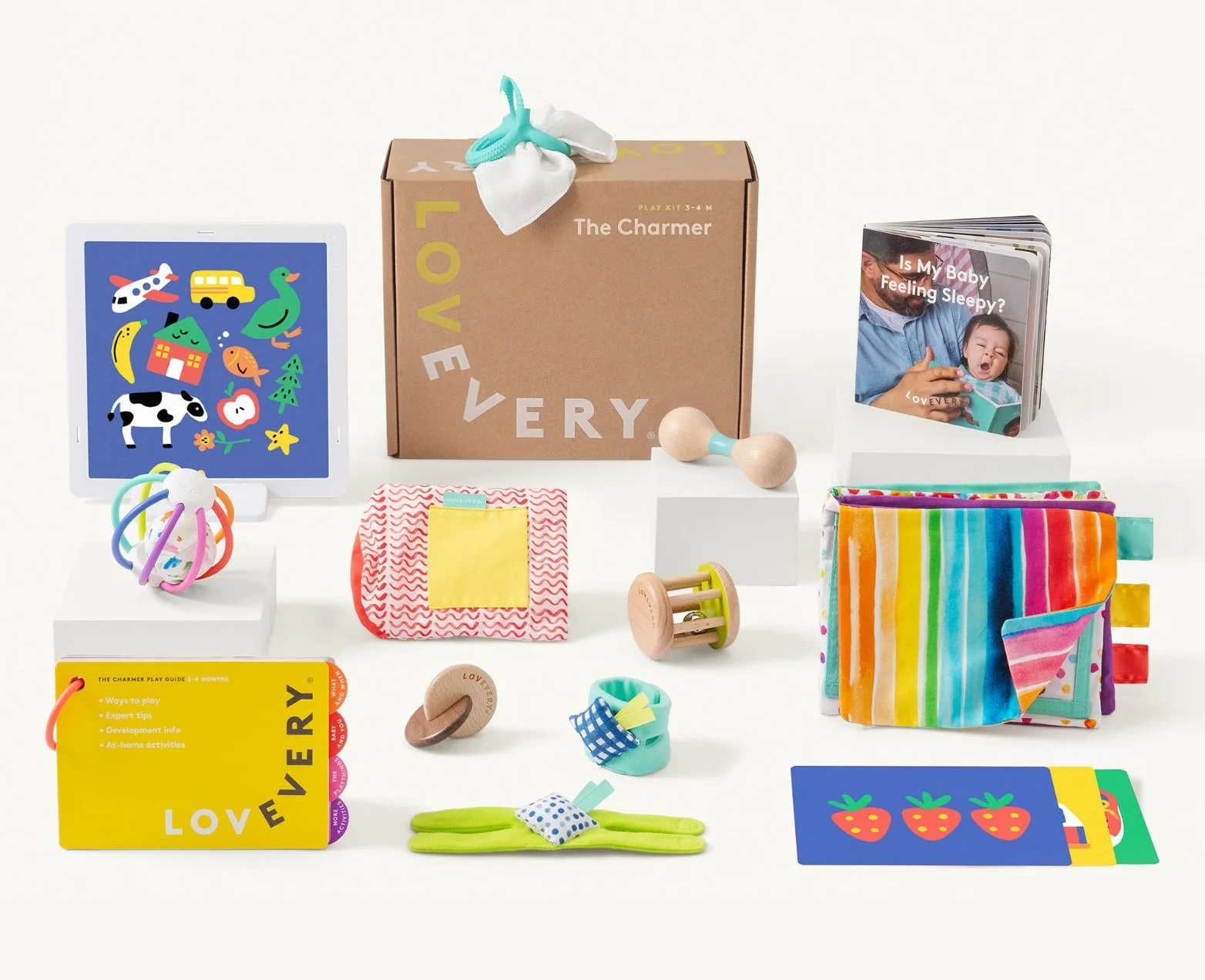
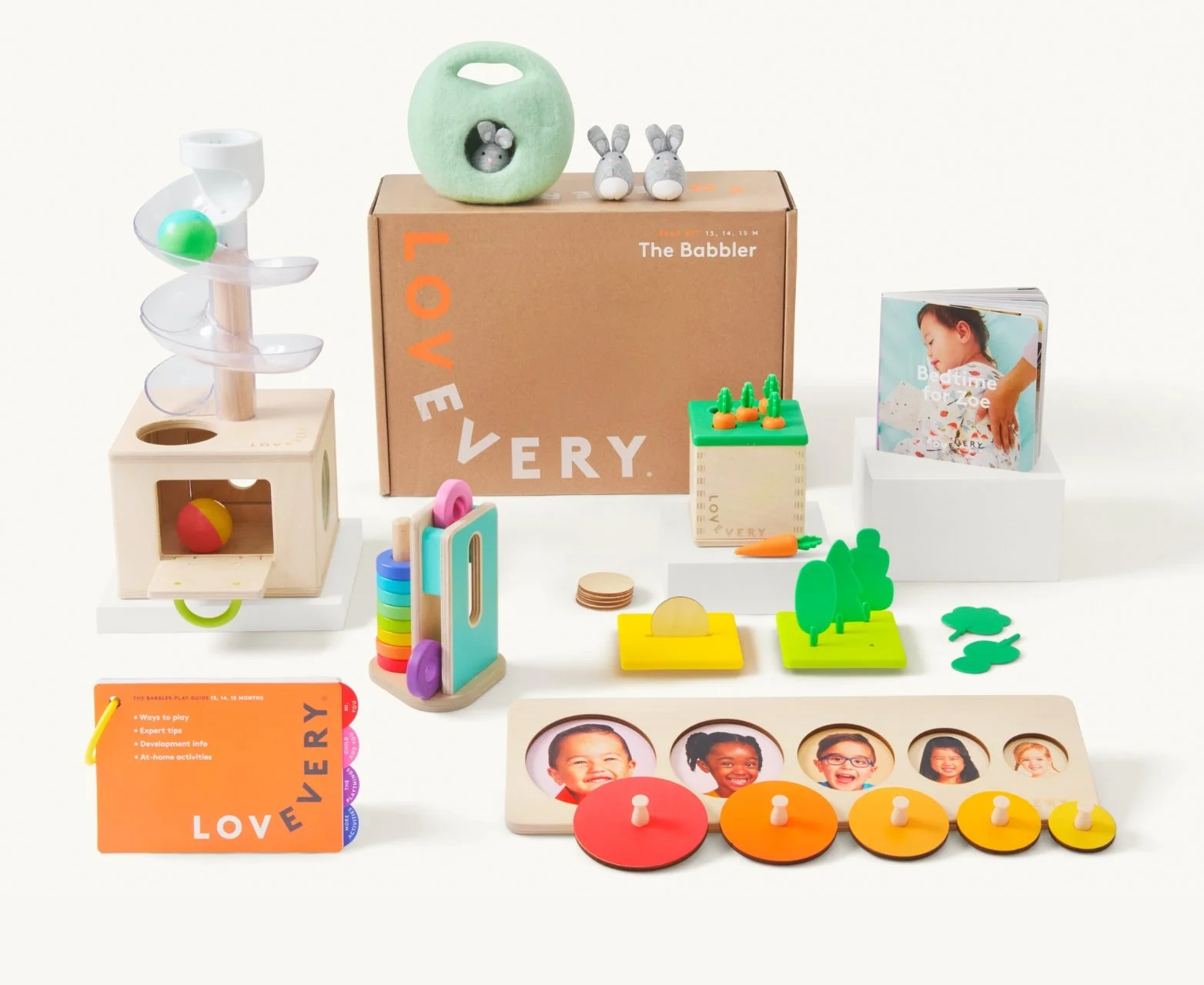
{ MERCHANDISING }
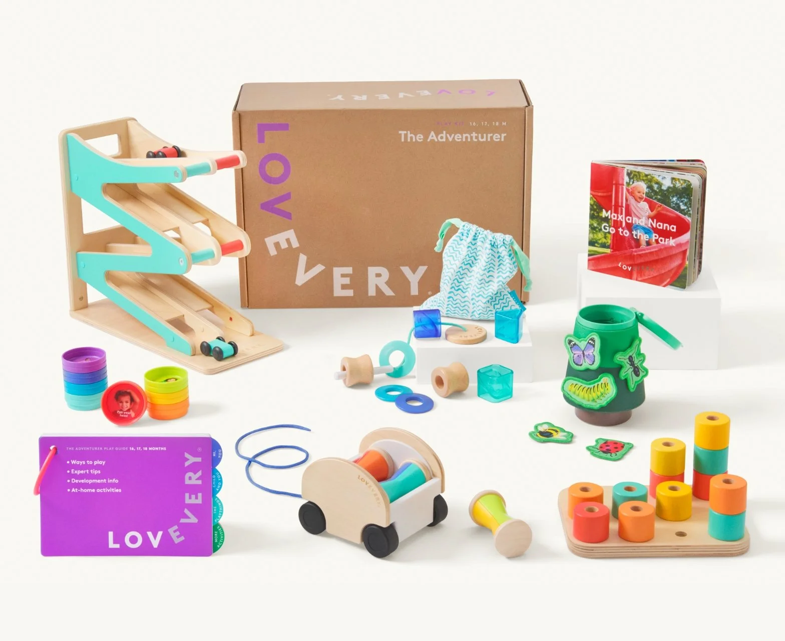
Every Play Kit, reshot
I rebuilt the Play Kit merchandising photography from the ground up so the products themselves reflect the refreshed brand.
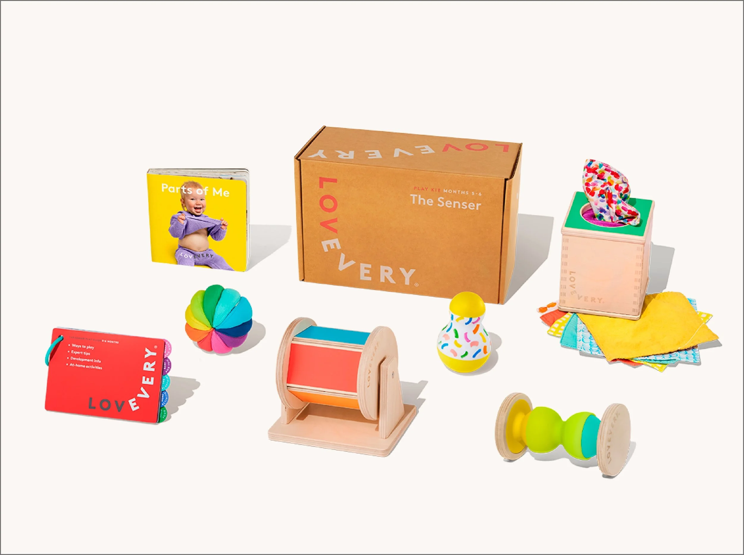
Hard Shadows · 3/4 angle
Before
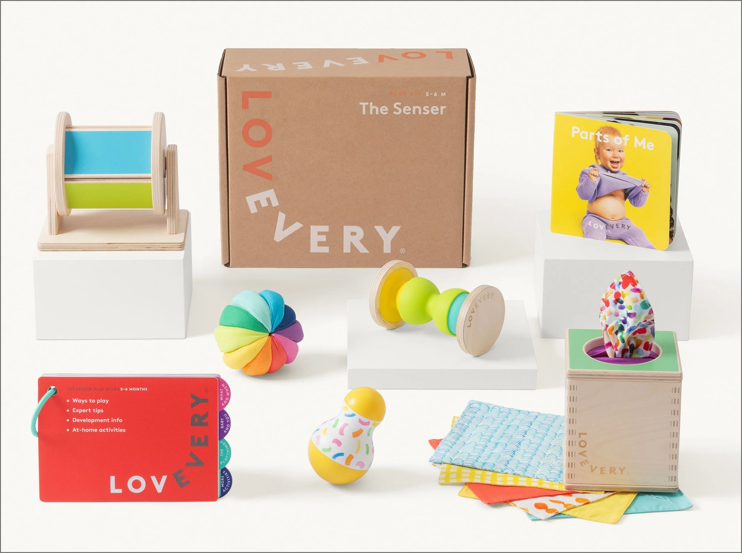
Diffused Shadows · Straight on
After
{ ALL TOGETHER }